Categories
Lies, Damned Lies and Survey Research
Data doesn’t have any pure meaning; it must be interpreted.
We read the following headline online a few days ago: “Optimistic people are healthier and wealthier”. Of course, this ‘discovery’ was driven by a quantitative research study. It was the lead for the story because it helped make the author’s point. It could well be true. The only trouble is that if any of us had the same dataset we might easily have drawn a very different conclusion; when you are healthier and wealthier, it’s likely easier to feel optimistic. Same data, different story altogether.
The Insider’s View
We all see many amazing headlines with data-based claims and lots of incredible videos online every day. They draw click-and-views generating income for somebody in this competitive world, and they help fill that endless 24×7 void. As a marketing and/or marketing research professional, you probably question more of what you see than the average viewer.
You know the power of data and how it can be cherry-picked and graphically presented to support different positions on a specific cause. You know that how a population is sampled, how survey questions are worded, the directions accompanying the survey, and the number and order of questions included, all impact the survey’s results. You also know that a poll or piece of survey research can be interpreted to support just about any results a project manager (or client) desires. Unfortunately, most of your coworkers and friends don’t have that same, enlightened insight.
Become a ‘Data Detective’
We were reminded of the indefiniteness accompanying survey research when recently reading a book written by Tim Harford, The Data Detective.
In his critique of the abuses of reporting on quantitative data, Harford suggests:
- We all realize that despite the logical outcome, that if you flip a coin ten times you won’t necessarily get five heads and five tails. If you flip it enough times however you will indeed get the 50/50 outcome. But go online and you can watch an “unedited” video of a person flipping a coin and in fact getting 10 heads in a row. What they don’t mention of course is how many hundreds of other flips took place before those ten in a row.
- Headlines screamed of a recent study showing that people are willing to pay 22% more for products they believed were produced by environmentally sensitive companies. The headline of the article, of course, didn’t explain the size of the sample nor that the research was conducted among a sample composed exclusively of college students! It also didn’t provide the labels given as response choices. But it attracted lots of attention from readers predisposed to the finding.
- Another headline reads “85 Richest People as Wealthy as the Poorest Half of the World”. Yes, sadly that’s true, but of course, any one of those billionaires (or even many 11-year olds, for that matter) is wealthier because half the people on earth have absolutely no assets. The factually true headline just wouldn’t seem as dramatic.
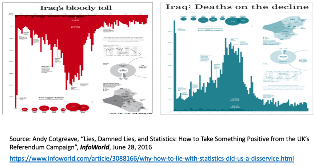
- How data is displayed and how those charts and graphs are headlined of course can change the entire story. Consider the following two different infographics that came out of the exact same data. “Iraq’s Bloody Toll” appeared in the South China Morning Post in late 2011 and was designed by Simon Scarr (the red chart below). It depicts the number of deaths per month in Iraq from 2003 until the beginning of the US withdrawal of troops at the end of 2011. Three simple choices create a strong emotive message: the aggressive title, the shocking choice of color, and the orientation of the histogram bars. The result is a very compelling ‘visual metaphor’. This is not deception; it is design put to great effect. This piece of work rightly won silver at the Malofiej international infographics awards festival in 2012.
- To dramatize how the same information could be used to support a very different understanding, social scientist Andy Cotgreave changed the three components (title, color, and orientation) in an alternative infographic, “Iraq: Deaths Declining” (the blue chart below). This gerrymandered infographic uses all the same data and components but suggests a very different conclusion. This reimagining makes an impactful presentation and shows how important it is for an audience to be mindful of accepting – without questioning – the ‘findings’ of any data.
Rules to Help Interpret Data
In his book, Harford summarizes his advice for the fair interpretation of the display of research findings in the form of “ten rules”. We’ve chosen five of the ten to list here:
#1 – Stop and notice your emotional reaction to a claim. Don’t simply accept or reject it because of how it makes you feel: accepting, reinforced, indignant, angry, etc.
#2 – Look for ways to combine the “bird’s eye” statistical perspective with the “worm’s eye” view from your personal experience.
#3 – Look at the labels on the data that are given, ask yourself if you really understand what is being described.
#6 – Ask what is missing from the data being shown and whether conclusions might be different if this missing information was included.
#10 – Keep an open mind—Ask how the presenter might be mistaken, and whether the cited facts may have changed.
You probably understand these caveats but you may wish to mention the book and the entire list of rules to anyone you know who might not have your working experience with data.
In Summation
When you hear a politician or other speaker, or read an article citing data, be curious. Ask yourself questions. Don’t allow your emotional response to dictate your acceptance or rejection of the conclusions.
Most of us are familiar with the description of how numbers can be used to champion a point of view, “lies, damned lies, and statistics.” (Popularized, though apparently not originated, by Mark Twain). As we studied and applied statistics to our daily work we learned to be cautious with the numbers we worked with and aimed to honor Twain’s cynicism. Unfortunately, not everyone has that same desire to find the ultimate truth. “Data is a language,” Kim Rees, co-founder of UK firm Periscopic, has observed, “It’s a means to convey an opinion, an argument.” If we understand that data themselves are neutral, we must contend with the understanding that they can be used in purposive ways – with the intent to manipulate perspectives. We are fairly certain that most Americans lack this understanding. They would benefit from Harford’s ten rules.
Comments
Comments are moderated to ensure respect towards the author and to prevent spam or self-promotion. Your comment may be edited, rejected, or approved based on these criteria. By commenting, you accept these terms and take responsibility for your contributions.
Disclaimer
The views, opinions, data, and methodologies expressed above are those of the contributor(s) and do not necessarily reflect or represent the official policies, positions, or beliefs of Greenbook.
More from Terry G.
The Troubling Legacy of the 2020 Election Polls
Why did the U.S. election pollsters get it wrong again? Can political polling learn from the past?
ARTICLES
Top in Research Methodologies
Future Trends Emerging in Mixed-Method Marketing Research
Explore the future of mixed-method marketing research, including AI, synthetic data, continuous insights, and evolving research workflows.
Ashley Shedlock
Content Producer at Greenbook
When Easy Becomes Empty: The Frictionless Feedback Fallacy
Making surveys easier doesn’t always improve insights. Discover why thoughtful feedback design balances convenience with meaningful, reflective respon...
Tarik Covington
Founder & Chief Strategist at Covariate. Human-Centered Insights
The Always-on Agency: How to Survive the Shift to Intelligence-Native Organizations
The insight agency model is under pressure. In an always-on world, success depends on becoming a decision partner, not just a supplier of research pro...
Hannah Mann
Founding Partner at Day One Strategy
The Ambiguity of Frequent Survey Participation: Is “Hyperactivity” a Signal of Professional Fraud?
Learn how to identify engaged respondents, detect bad actors, and improve data quality for more reliable research outcomes.
Sebastian Berger
Head of Science ReDem at Rep Data

Sign Up for
Updates
Get content that matters, written by top insights industry experts, delivered right to your inbox.