Categories
The 4-Step Process to Improve Usability of Web Surveys
How to build surveys that will improve data quality and reduce respondent burden.
As research professionals, we need to be conscious of the relationship between design and usability when creating research studies. More often than not, poorly designed research is unintentional and can occur when aesthetics are placed higher than usability — like designing a survey that matches your brand’s colors, but requires a lot of effort to navigate. To help avoid this, researchers should focus more on how to design studies that will improve data quality and reduce respondent burden.
It’s important to realize that people won’t always use designs the way they were intended to be used. This usually occurs because the user’s goals are different from the designer’s goals. Respondents are generally going to take the shortest path possible to complete what’s needed and researchers need to design surveys toward that goal.
Don Norman sums it up nicely, “Good design is harder to notice than poor design, in part because good designs fit our needs so well that the design is invisible.” The goal is for respondents not to have to think about how to complete a study.
So how do we create invisible designs?
- Choose words carefully
- Use visual clues
- Simplify the task
- Alignment between words and visual design
Say what you mean, mean what you say
When designing research, it’s important to keep in mind that people don’t read, they scan. A website usability study by the Nielsen Norman Group found that 79% of users scanned web pages and only 16% read every word. Surveys are not websites, of course, but there’s some evidence that users treat text-heavy surveys in the same way.
Text scanning is more common than we think. Respondents often read only what they think they need to answer the question. By carefully choosing the wording used, researchers can ensure they will obtain the desired information needed to complete the study. One easy way to do this is to revise questions for brevity without sacrificing clarity.
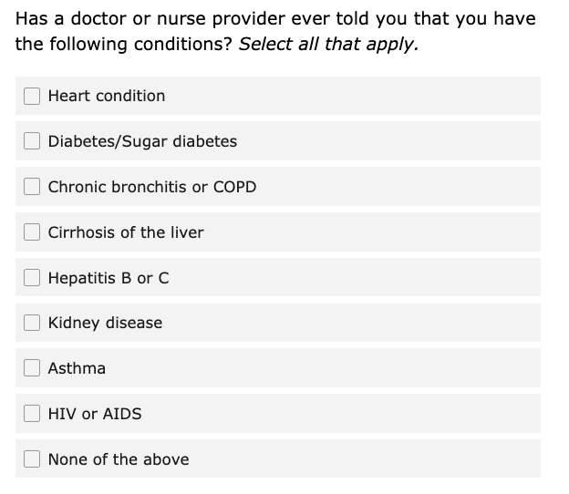
Let’s take for example the question below, this question has three lines of text and the last two lines are the instructions. Knowing that people skim, it’s going to be hard for them to find the question – and to know what they are supposed to be answering.
Visuals Go a Long Way
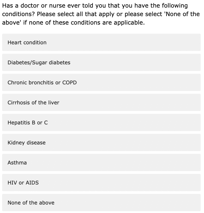
Using visual clues instead of words can also help convey question meaning. There are two ways to do this in your surveys. One way is using different formatting for question text, instructions, response options. Research suggests that people are less likely to read text in italics, so having the question in a regular font and the instructions in italics can indicate to the respondents where to find crucial information. The other way to do this is by using visual cues to emphasize what is needed. For example, many people associate radio buttons with “select one” and checkboxes with “select all.” By using checkboxes, many people will automatically know that the question is a “select all that apply” without having to read or think.
Other visual cues you can use:
- adjusting the size of the text box to fit the answer you want
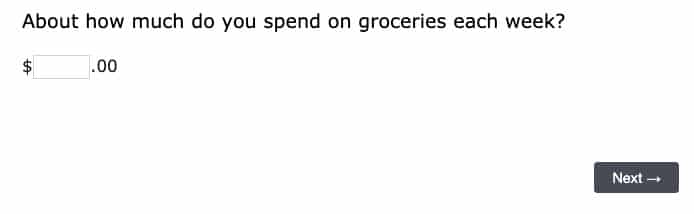
- adding text or symbols before/after a text box can also help clarify what information you’re looking for
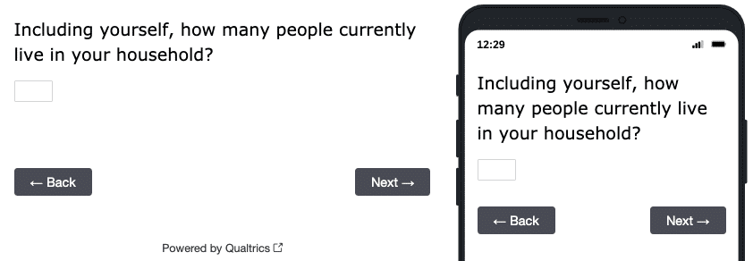
- changing the input type: a numeric keyboard suggest you want a number and it also makes it easier for mobile respondents to provide the information in the format you want
Simplicity is best
Simplifying the task for respondents can yield more accurate results. If the task is too complex, simply adding more instructions is not going to help. One way to do this is by breaking the question into multiple parts such that each question is asking about one simple construct. Remember, respondent burden is not determined just by the number of questions, but also by the complexity of the questions. A 10 question survey with simple, straight forward questions will be perceived as easier than a 5 question survey that’s complex or confusing.
Simple design also extends to cognitive simplicity. When people answer survey questions, they often use shortcuts like anchoring and adjusting. For example, they may think something is “slightly worse than average” or that “it’s not the best thing but it’s pretty good.” So a person will then pick the category just below the middle to mean “a little worse than average” or the second-to-top category to mean “Good, but not the best.” However, when the visual midpoint is different from the conceptual midpoint, it can lead to bias.
In the image below, the conceptual midpoint is “About the right amount,” which is the category that falls in the middle of the response options that go from “Far too much” to “Far too little.” However, because this question includes a “Don’t Know” category, the visual midpoint is “Too little.” Because the conceptual midpoint and the visual midpoint do not match, responses will be biased toward the bottom of the scale.
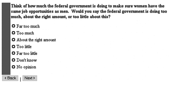
Tourangeau R., Couper M., Conrad F. (2004). Spacing, Position, and Order: Interpretive Heuristics for Visual Features of Survey Questions. Public Opinion Quarterly, 68(3): 368-393.
To align the conceptual midpoint and the visual midpoint, add a line or space between the scaled response choices (e.g., very good to very bad) and any non-substantive options (e.g., Don’t Know or Not sure).
Inclusive research design
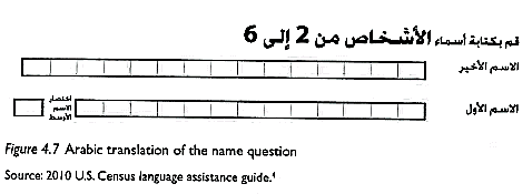
Although most of my advice is based on research with US populations, usability research suggests that many fundamental principles hold true across most countries. For example, in the US, we read from left to right, and so when people scan we see that F-shaped pattern. In countries that use Arabic, they read from right to left so the scanning properties are consistent, it is just the mirror image of an F-shaped pattern.
This specific finding is from a paper survey, but it’s relevant for showing how cultural differences affect visual design. The form was designed in English, but they also needed an Arabic version. So they designed the survey form to fit Arabic culturally. However, it turned out that it still was not usable.
Pan, Sha, Park (2020). Sociolinguistics of Survey Translation (62-65). Routledge.
While the individual boxes for letters worked for languages with print letters, it did not work in Arabic, which uses script. The individual boxes had to be replaced by open text boxes so that people could enter their names correctly. While many aspects of usability are the same in other cultures, it is important to conduct user testing before fielding a survey. There are going to be differences in how people from different countries use certain web features too. Conventions that exist in one culture might not in another.
As researchers, we’re tasked with anticipating how people interact with our studies and making sure we’ve taken the right actions to simplify the experience and maximize accuracy. Every strong design is rooted in easing the process for respondents — and how we act on that belief is the difference between a successful design and a poor one.
Header Image: Susan Yin, Unsplash
Comments
Comments are moderated to ensure respect towards the author and to prevent spam or self-promotion. Your comment may be edited, rejected, or approved based on these criteria. By commenting, you accept these terms and take responsibility for your contributions.
Disclaimer
The views, opinions, data, and methodologies expressed above are those of the contributor(s) and do not necessarily reflect or represent the official policies, positions, or beliefs of Greenbook.
ARTICLES
Top in Research Methodologies
Future Trends Emerging in Mixed-Method Marketing Research
Explore the future of mixed-method marketing research, including AI, synthetic data, continuous insights, and evolving research workflows.
Ashley Shedlock
Content Producer at Greenbook
When Easy Becomes Empty: The Frictionless Feedback Fallacy
Making surveys easier doesn’t always improve insights. Discover why thoughtful feedback design balances convenience with meaningful, reflective respon...
Tarik Covington
Founder & Chief Strategist at Covariate. Human-Centered Insights
The Always-on Agency: How to Survive the Shift to Intelligence-Native Organizations
The insight agency model is under pressure. In an always-on world, success depends on becoming a decision partner, not just a supplier of research pro...
Hannah Mann
Founding Partner at Day One Strategy
The Ambiguity of Frequent Survey Participation: Is “Hyperactivity” a Signal of Professional Fraud?
Learn how to identify engaged respondents, detect bad actors, and improve data quality for more reliable research outcomes.
Sebastian Berger
Head of Science ReDem at Rep Data

Sign Up for
Updates
Get content that matters, written by top insights industry experts, delivered right to your inbox.