Categories
Cartograms: A Visualization Technique for Researchers
As market researchers seek out better visualization techniques, it is worth investigating the cartogram.

Courtesy of http://www.thecreatorsproject.com/blog/blocking-your-view-data-visualization-with-legos
By Jeffrey Henning
As market researchers seek out better visualization techniques, it is worth investigating the cartogram. A cartogram is a map in which geographic entities (counties, states or countries) are resized according to any dimension of interest: population, sales, or – given that we are in election season – electoral votes.
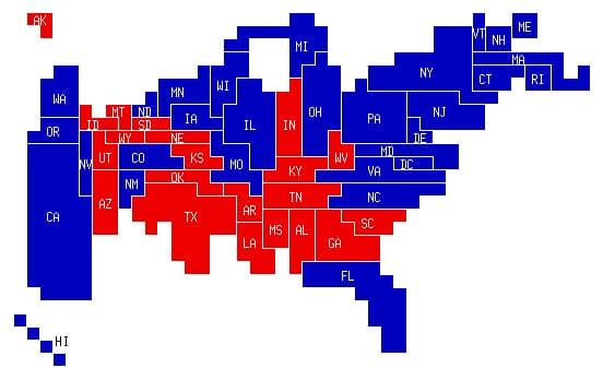
When studying maps and charts, we recognize large areas as being more important. Which makes it confusing to see something like the 2008 U.S. electoral map below:
Source: Wikipedia, http://en.wikipedia.org/wiki/United_States_presidential_election,_2008
Visually it looks like John McCain (represented by the red states) won the presidential election. But while the red areas are visually larger, the blue states represent 68% of the votes in the Electoral College (365 votes) to the red state’s 32% (173 votes). That’s because the red states are more sparsely populated and electoral votes correlate to population (every state gets a minimum of 3 votes: 2 for its senators and then 1 for each representative, allocated by population).
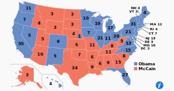
Now contrast the above map to a cartogram, where the states have been resized to visually convey how many electoral votes they have:
Source: Colley Rankings, http://colleyrankings.com/election2008/
Here the greater electoral value of the 2008 blue states is discernible at a glance.
J. Richard Gott created this chart simply by drawing each state on graph paper with one square per electoral vote. In addition, he made sure that “all states which touch in reality touch on the map”. You can create cartograms as simply as that.
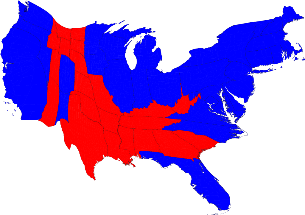
Alternatively, you can use specialty software to produce results that preserve more of the geographic features of individual states. Take this example:

Source: M. E. J. Newman, http://www-personal.umich.edu/~mejn/election/2008/stateelecredblue1024.png
How can you use cartograms in your work? To show locations, sales, market share or other attributes by state or country. For instance, here’s the number of locations by state for three major brands:
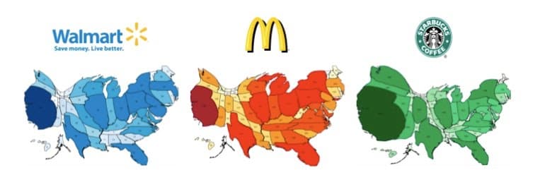
Source: Steph Abegg, http://www.stephabegg.com/home/projects/cartograms
To learn more about cartograms, check out:
Comments
Comments are moderated to ensure respect towards the author and to prevent spam or self-promotion. Your comment may be edited, rejected, or approved based on these criteria. By commenting, you accept these terms and take responsibility for your contributions.
Disclaimer
The views, opinions, data, and methodologies expressed above are those of the contributor(s) and do not necessarily reflect or represent the official policies, positions, or beliefs of Greenbook.
More from Jeffrey Henning
How to Write Like an AI
Some “tips” so that you can continue to enjoy writing, while pretending to simply be an editor of AI-generated content.
A Festivus for the Rest of Us Respondents
Reflecting on how we can improve survey design for respondents.
Aliens vs. Dinosaurs
Given the diverse backgrounds of market researchers, there is a real need to continuously train.
Researchers and the Love of Learning
MRII’s survey on how the market research industry is doing in career satisfaction, growth opportunities, and learning preferences.
ARTICLES
Top in Research Methodologies
Future Trends Emerging in Mixed-Method Marketing Research
Explore the future of mixed-method marketing research, including AI, synthetic data, continuous insights, and evolving research workflows.
Ashley Shedlock
Content Producer at Greenbook
When Easy Becomes Empty: The Frictionless Feedback Fallacy
Making surveys easier doesn’t always improve insights. Discover why thoughtful feedback design balances convenience with meaningful, reflective respon...
Tarik Covington
Founder & Chief Strategist at Covariate. Human-Centered Insights
The Always-on Agency: How to Survive the Shift to Intelligence-Native Organizations
The insight agency model is under pressure. In an always-on world, success depends on becoming a decision partner, not just a supplier of research pro...
Hannah Mann
Founding Partner at Day One Strategy
The Ambiguity of Frequent Survey Participation: Is “Hyperactivity” a Signal of Professional Fraud?
Learn how to identify engaged respondents, detect bad actors, and improve data quality for more reliable research outcomes.
Sebastian Berger
Head of Science ReDem at Rep Data

Sign Up for
Updates
Get content that matters, written by top insights industry experts, delivered right to your inbox.