Categories
Your Logo is a Storyteller
Weighing in on descriptive vs. non-descriptive logos.
Has anyone ever created a more inspirational logo than NASA?
Introduced in 1959, the iconic blue circle was festooned with stars, an orbital path, and an abstract red supersonic wing. For a nation captivated by the race to the moon, the image represented the promise of space exploration and America’s seemingly infinite power.
But when NASA’s mission changed in the 1970s, the logo changed, too. Gone were stars and the sense of wonder, replaced by what came to be known as “the worm”.
“The worm was intentionally designed without any stars or aircraft in it,” explained NASA historian Bill Barry. “NASA could then be anything you wanted it to be, including not a space agency.”
And when morale at NASA was in dumpster after the Challenger disaster and repeated delays in launching the Hubble Space Telescope, the worm turned. The blue circle came back, revived by a new NASA administrator who “thought the resurrection of the old logo from the moon landings would help boost morale”.
NASA
So, which logo was better?
Descriptive vs. non-descriptive
A study published in the Journal of Marketing Research reviewed the logos of nearly 600 companies to compare the impact of what the researchers labelled descriptive and non-descriptive logos.
NASA’s blue circle is a descriptive logo, which is characterized by “textual or visual design elements…indicative of the type of product marketed by a brand”. The red “worm” logo is non-descriptive. As Barry suggested, it could have been a logo for anything. Had you never heard of NASA, you might have seen that logo and assumed it was a television network or a brand of tortilla chips.
The authors found that, in general, descriptive logos like the blue circle are better for brand equity. They are more likely to improve brand perceptions, increase purchase intent, and bolster sales.
For example, Animal Planet was onto something when it changed its logo to incorporate a whimsical elephant.
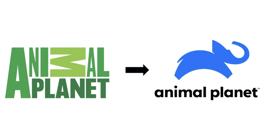
ANIMAL PLANET
Popeyes’ logo became more descriptive in 2020 with the addition of a chicken, apparently strutting bravely into the poultry afterlife on its way to your stomach.
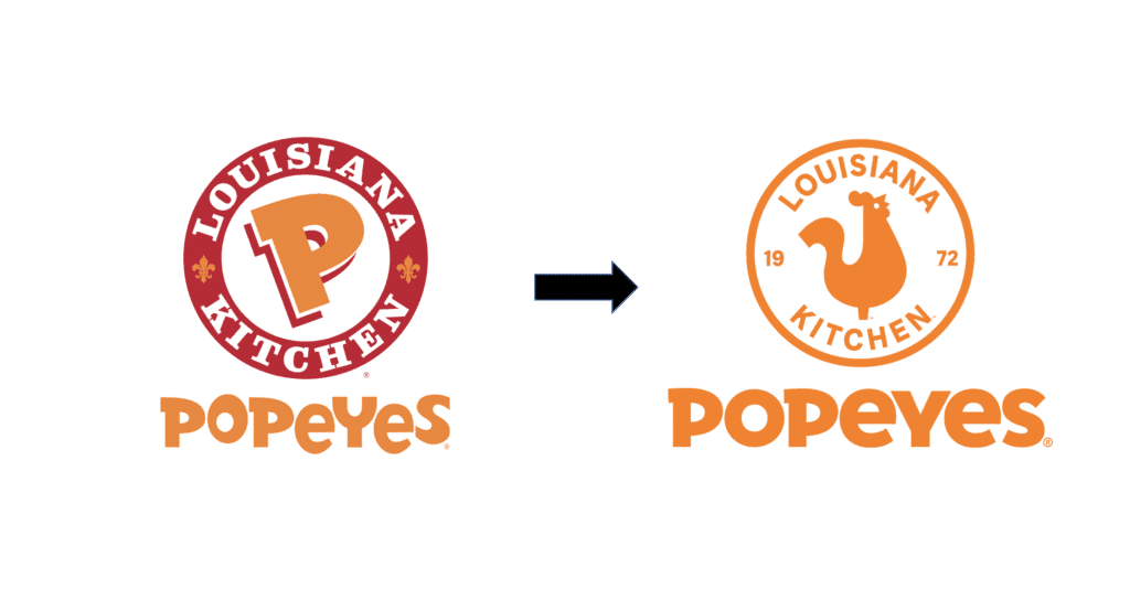
POPEYES
Often, descriptive logos work metaphorically. Burger King was probably wise to retain not only the word “Burger” but also the stylized image of its signature Whopper in its revamped logo. Instagram’s “product” is hard to describe in a word or two, but the logo’s subtle resemblance to an old Polaroid camera makes it descriptive, to an extent.
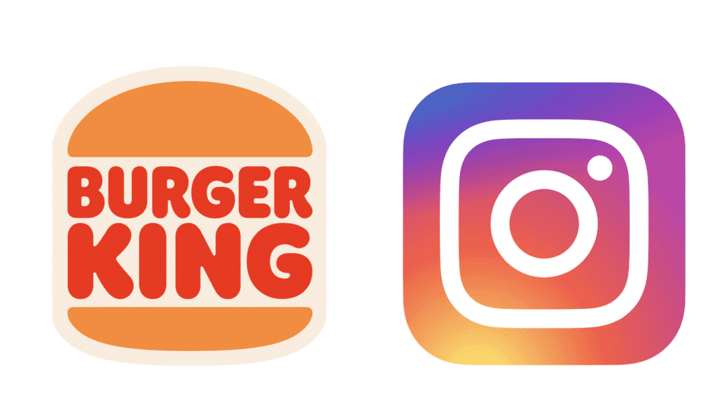
BURGER KING; INSTAGRAM
We are witnessing a trend in logos becoming bolder and less detailed, in part so they can be more easily reproduced on smaller screens. However, some brands may have lost something in the transition. For example, Vimto, a mixed-fruit carbonated soft drink, has replaced its highly descriptive fruit tornado with a hulking, non-descriptive “V”. The Gmail logo has grown non-descriptive over time, as the word “mail” and the image of the envelope have gradually disappeared.
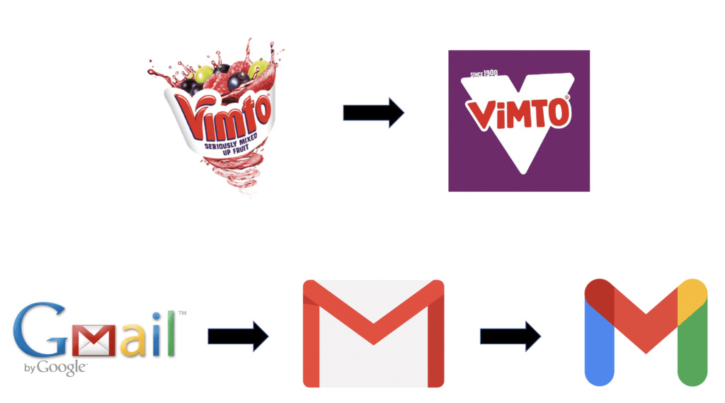
VIMTO; GMAIL
Exceptions to the rule
This does not mean a descriptive logo is always preferable. The research suggests that the more established the brand, the less pronounced the effect of a descriptive logo. McDonald’s non-descriptive golden arches, for example, work just fine, thank you. Starbucks eliminated the word “coffee” from its logo in 2011, but it probably made no difference. By that point, everyone knew the brand, and its familiar mermaid logo could stand on its own.
Moreover, the authors note that non-descriptive logos work better if a brand is associated with negative concepts. In other words, if you are a funeral home, keep that casket out of your logo. If you are an exterminator, think twice about images of creeping cockroaches and dead rats.
Shifting to a non-descriptive logo also is a good idea when a brand seeks to broaden the associations attached to it – which was NASA’s goal with the red “worm”. More recently, in its quest to become known for a full menu of breakfast fare, Dunkin’ pointedly removed the word “Donuts” and the coffee cup from its logo.
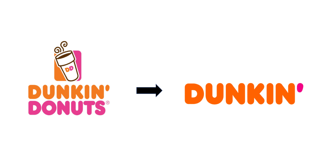
DUNKIN’
The importance of emotion
But all else being equal, why are descriptive logos so powerful? With apologies to Rod Stewart, every picture tells a story. It is impossible to gaze upon a painting like Nighthawks or a photograph like Dorthea Lange’s Migrant Mother and not begin to add your own interpretation. How did these people get here? What are they doing? How are they feeling? Where are they going?
Like a work of art, a descriptive logo guides our interpretations and sparks our thinking – usually unconsciously. When we see the word “burger” and the outline of a Whopper in the Burger King logo, we form a mental consumption vision for what eating that burger will be like. We may never have drunk a Vimto, but the cyclone of fruit illustrated the whirlwind of flavor that awaited us if we ever did. The blue NASA logo inspired Americans to embrace the impossible.
That’s also why companies are better off leaving well enough alone if their non-descriptive logos have become iconic and therefore part of consumers’ memory structures. Those logos can tell stories, too – or, more specifically, they activate stories consumers have created for themselves over time.
Were McDonald’s ever to scrap the golden arches it would disrupt the emotional memories that loyal customers, in particular, have of the brand. The founder and creative director at Nomad, Stuart Watson, has described the power of the non-descriptive Hot Wheels logo to magically transport him back to childhood. The Lego logo is non-descriptive, but look at it and try not to imagine the fun of snapping those bricks together.
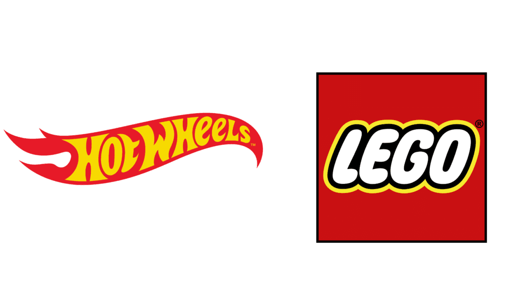
HOT WHEELS; LEGO
On the other hand, a logo that isn’t connected with years of positive memories or that doesn’t conjure a consumption vision tends to melt into the wallpaper.
In other words, effective logos connect us emotionally to a brand. It is noteworthy that two categories that have historically featured an abundance of descriptive logos, at least in the U.S., are children’s hospitals and professional sports franchises, both of which are dependent on creating powerful emotional experiences.
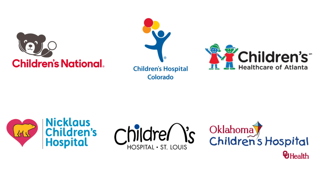
CHILDREN’S NATIONAL; CHILDREN’S HOSPITAL COLORADO; CHILDREN’S HEALTHCARE OF ATLANTA; NICKLAUS CHILDREN’S HOSPITAL; CHILDREN’S HOSPITAL ST. LOUIS; OKLAHOMA CHILDREN’S HOSPITAL
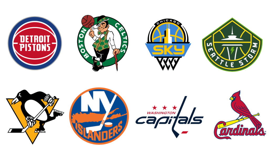
DETROIT PISTONS; BOSTON CELTICS; CHICAGO SKY; SEATTLE STORM; PITTSBURGH PENGUINS; NY ISLANDERS; WASHINGTON CAPITALS; ST. LOUIS CARDINALS
Children’s hospitals are trying to reduce fear and provide hope for both kids and their parents. Sports teams are looking to create strong and lasting loyalty – players come and go, but a logo offers a sense of continuity. Indeed, several of the sports logos depicted above officially disappeared for a period of time, only to return, in part because of how closely they were tied to memories of the franchise. Diehard fans simply refused to let them go.
Designing a logo might be harder than ever. You need a visual (or set of visuals) that will work just as well on an outdoor billboard as on a phone or smartwatch. But there is more to consider than just readability. Marketers should also contemplate the descriptive power of their logo and the story it tells about their brand.
Comments
Comments are moderated to ensure respect towards the author and to prevent spam or self-promotion. Your comment may be edited, rejected, or approved based on these criteria. By commenting, you accept these terms and take responsibility for your contributions.
Disclaimer
The views, opinions, data, and methodologies expressed above are those of the contributor(s) and do not necessarily reflect or represent the official policies, positions, or beliefs of Greenbook.
More from James Forr
AI is an Opportunity. The Problem is IA—Insight Atrophy
The danger isn’t AI, but losing insight skills. Reclaim storytelling, imagination, and intuition to keep human insight at the center.
‘Living’ Brands: Getting Macs and Avoiding Noids
In advertising, personification can say what words can’t.
How COVID Has Molded Consumers’ Memories
Memory is fragile and flexible, which presents challenges for consumer researchers, but also great opportunities for marketers.
ARTICLES
Top in Insights Industry News
Qualtrics X4 and the New Questions Facing Insights Leaders
Qualtrics X4 2026 marked a pivot from AI hype to trust and action. Explore how insights leaders navigate synthetic research and the evolving role of j...
Karen Lynch
Chief Programming Officer at Greenbook
The Signal from QRCA 2026: AI Moderation is Good Enough, Sometimes
A decision matrix to choose AI-only, Hybrid, or Human-only based on risk, stakes, and nuance.
Karen Lynch
Chief Programming Officer at Greenbook
Follow the Spark: Why San Antonio Is The Place for Qual in February
At QRCA San Antonio, gain practical skills, peer insight, and new ideas to return to your work with clarity and renewed momentum.
Kristin Marino
Chair 2026 Conference at QRCA
Walmart Data Ventures and Data Quality Co-Op Redefine Authentic Insights
How Walmart’s Customer Spark Community Raises the Bar for Data Quality
Leonard Murphy
Chief Advisor for Insights and Development at Greenbook

Sign Up for
Updates
Get content that matters, written by top insights industry experts, delivered right to your inbox.