Categories
How Not To Be Boring and Dull in the World of Market Research
When it comes to branding, market research companies aren’t excluded from the need to do this.
I’m sure you will all agree with me that there are lots of articles, point of views and arguments around brand identity, brand personality and advertising. When it comes to branding everyone’s got a lot to say about how companies & organizations should or shouldn’t use design as a tool of communication. Market research companies aren’t excluded in this hype either.
As I was reading through an interesting article by Lucy Davison & Paul Buckley about the importance of branding in market research, The Future’s Bright, The Future’s Branded; my curiosity was piqued by their recent visual exploration based on 25 global research company identities. They analyzed each logo according to six design fundamentals: Colour, shape, form, font, imagery, and symbol. But what they found was an overwhelming use of blue & grey. In addition to this, the square was the dominant logo shape applied in most designs
So what does it all mean? Why blue, grey and square?
When it comes to design, color plays an important role. Each color has its own meaning and many believe that if a certain color is used in the right place the results could be extremely successful.
For example, have you ever wondered why the majority of food chain restaurants have used red, yellow or a combination of both as their primary color in their branding? Think of Mc Donald’s, KFC, Burger King, Nando’s, Dominos and Pizza Hut. In color psychology, red and yellow are known to subconsciously stimulate appetite and increase excitement. According to recent studies, people tend to spend more and leave quickly if they are surrounded by red & yellow color combinations in a restaurant, which is exactly what fast food businesses want you to do and here they’re achieving it by just applying a simple color principle!


The same theory applies to market research. There is a reason why blue and grey are the dominant colors when it comes to research company brand identity and yet again that reason is linked to the psychology behind colors and our subconscious mind.
In color theory, blue is associated with intelligence, communication & confidence. Different shades of blue also provide mental clarity, prove productivity and instill trust. Similar to blue, grey is known as the color of neutrality, wisdom, stability, and compromise – all potentially positive attributes for a market research company.
But let’s not forget that while these two colors are known for having many positive and intellectual meanings, overusing them can also communicate stillness, settlement, and aloofness. Often this familiarity and stability along with their commonness, well, can seem boring and dull!!
So how can design help us?
Now that we’ve come to an understanding about why the world of market research might seem a bit bland, it’s time to dig a bit deeper into ways of improving our brand image by using the right design theory.
While color is one of the most important parts of any design, it’s not the only fact we should focus on. When it comes to design, each element has its own characteristic. Shapes, fonts, lines, patterns, textures, contrast, composition they all communicate messages separately but when we put them all together, within the right hierarchy, that’s when the magic starts.
Visual hierarchy is a simple but essential design principle. This is the art of organising & prioritising design elements into a form of layout that guides your audience’s eyes from one element to another. Where you want your audience to look first, what’s the first call of action you want to draw attention to and how punchy you want your message to come across are all dependent on gaining a good understanding of visual hierarchy.
To give you a better understanding of this principle I created a layout to show you how visual hierarchy works in a simple example. Look at the image below and try to memorize your eyes movement on the page.
I can pretty much guarantee that your eyes traced on the page like this:
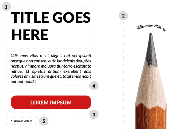
If my assumptions were right, your eyes focused on the big bold title on the left first. You then got dragged into the right side looking at the tiny text on top of the pencil pointing at it. The colored box was the third element your eyes paid attention to. You then looked at the paragraph to find out what the content is about. Finally, the small text underneath the red box was the last element you paid attention to.
Now here’s the same content showed on a page without a strong sense of hierarchy:
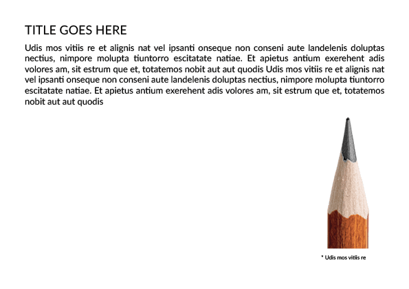
Boring? Confusing? Uninteresting? I thought so.
You probably noticed that your eyes are finding it hard to focus on one specific element on the page and if you keep looking at the image then the chunky paragraph above it thinking “Oh god who wants to read that?” I won’t blame you!
This is what the hierarchy does. It makes your content look interesting. It encourages your audience to focus on different elements based on their importance. It brings movement to the page and it creates the right balance between your text and image.
Q: “I’m not a designer, what should I do?”
A: Use your toolbox more often!
The good news is that you don’t have to be a designer in order to achieve hierarchy. You just need to experiment a bit more with your toolbox. Whether you’re using PowerPoint or even Word as your primary platform or a more advanced software like Adobe InDesign, you can still create a hierarchy that communicates your content efficiently.
In my next post, I will show you how by adjusting the font size, creating contrast, placing imagery and using colors you can achieve hierarchy more in-depth.
Thanks for reading & until next time!
Useful links:
Comments
Comments are moderated to ensure respect towards the author and to prevent spam or self-promotion. Your comment may be edited, rejected, or approved based on these criteria. By commenting, you accept these terms and take responsibility for your contributions.
Disclaimer
The views, opinions, data, and methodologies expressed above are those of the contributor(s) and do not necessarily reflect or represent the official policies, positions, or beliefs of Greenbook.
More from Mahdis Nikou
Achieving Visual Hierarchy for Non-designers – A Step by Step Guide
Are you sharing your data in a way that looks great and is interesting enough to be read, understood and remembered?
A Monthly Dose of Design
Introducing a new series that will explore topics related to design, branding and visual communications in the world of research.
ARTICLES
Top in Insights Industry News
Qualtrics X4 and the New Questions Facing Insights Leaders
Qualtrics X4 2026 marked a pivot from AI hype to trust and action. Explore how insights leaders navigate synthetic research and the evolving role of j...
Karen Lynch
Chief Programming Officer at Greenbook
The Signal from QRCA 2026: AI Moderation is Good Enough, Sometimes
A decision matrix to choose AI-only, Hybrid, or Human-only based on risk, stakes, and nuance.
Karen Lynch
Chief Programming Officer at Greenbook
Follow the Spark: Why San Antonio Is The Place for Qual in February
At QRCA San Antonio, gain practical skills, peer insight, and new ideas to return to your work with clarity and renewed momentum.
Kristin Marino
Chair 2026 Conference at QRCA
Walmart Data Ventures and Data Quality Co-Op Redefine Authentic Insights
How Walmart’s Customer Spark Community Raises the Bar for Data Quality
Leonard Murphy
Chief Advisor for Insights and Development at Greenbook

Sign Up for
Updates
Get content that matters, written by top insights industry experts, delivered right to your inbox.