Categories
Achieving Visual Hierarchy for Non-designers – A Step by Step Guide
Are you sharing your data in a way that looks great and is interesting enough to be read, understood and remembered?
Last month we learned that visual hierarchy:
- Is the art of organizing and prioritizing design elements into a form of layout that guides your audience’s eyes from one element to another
- Encourages your audience to focus on different elements based on their importance
- Brings movement to the page and creates the right balance between text and images
As you’ve probably figured out by now, all of the above can become extremely handy when you’re about to write a report, present your findings, or submit a proposal to your client.
You have pages and pages of written information, key points, important stuff that you’ve worked so hard to put together and now it’s time to show them off! Of course, it’s easier to write everything in a word document and send them across. But is it as powerful and as efficient than a document that looks great, communicates every bit directly and it’s interesting enough to be read, understood, and remembered? No.
So let’s begin…
Creating visual hierarchy
Before you start the process, ask yourself: what is it that you’re trying to convey? What are the MOST, LESS, LEAST important things on the page that you want to show?
When you have a clear idea about the importance of each part of your content, you then need to emphasize 3 design elements listed below. This is how a basic and simple visual hierarchy is born!
- Color
- Size
- Placement
Color
Find or create a balanced color palette. A balanced color palette is should contain a few dark, bright, and subtle shades. Just remember that you don’t need a rainbow to make your point. In fact, having only two or three shade of colors is more practical than having more. Too many different colors in one place can distract the eyes.
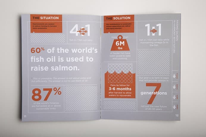
The image below is sourced from designspiration.net. This is to show you how having a simple color palette can help bring the information to life and also create the right balance of color in your visual hierarchy.
In this example, the gigantic numbers are important. They are important enough to be presented by the color yellow, the brightest shade on the page.
The color blue, on the other hand, has a less punchy tone to it and it is the second priority on the page that you would pay attention to. Images in dark grey are the design element you would focus on the least and their purpose is to give you an idea about the topic at first sight.
Now that you know the data and have an idea about what the content might be saying just by a quick look, you are more encouraged to read the paragraphs to find out more. Plus, those giant yellow numbers will most probably stick at the back of your mind for a longer period afterward.
Useful link to create awesome color palettes: http://www.colourlovers.com/
On this website, you can find tons of pre-made color palettes by the users. Or you can type your keywords in to find a palette right for your needs.
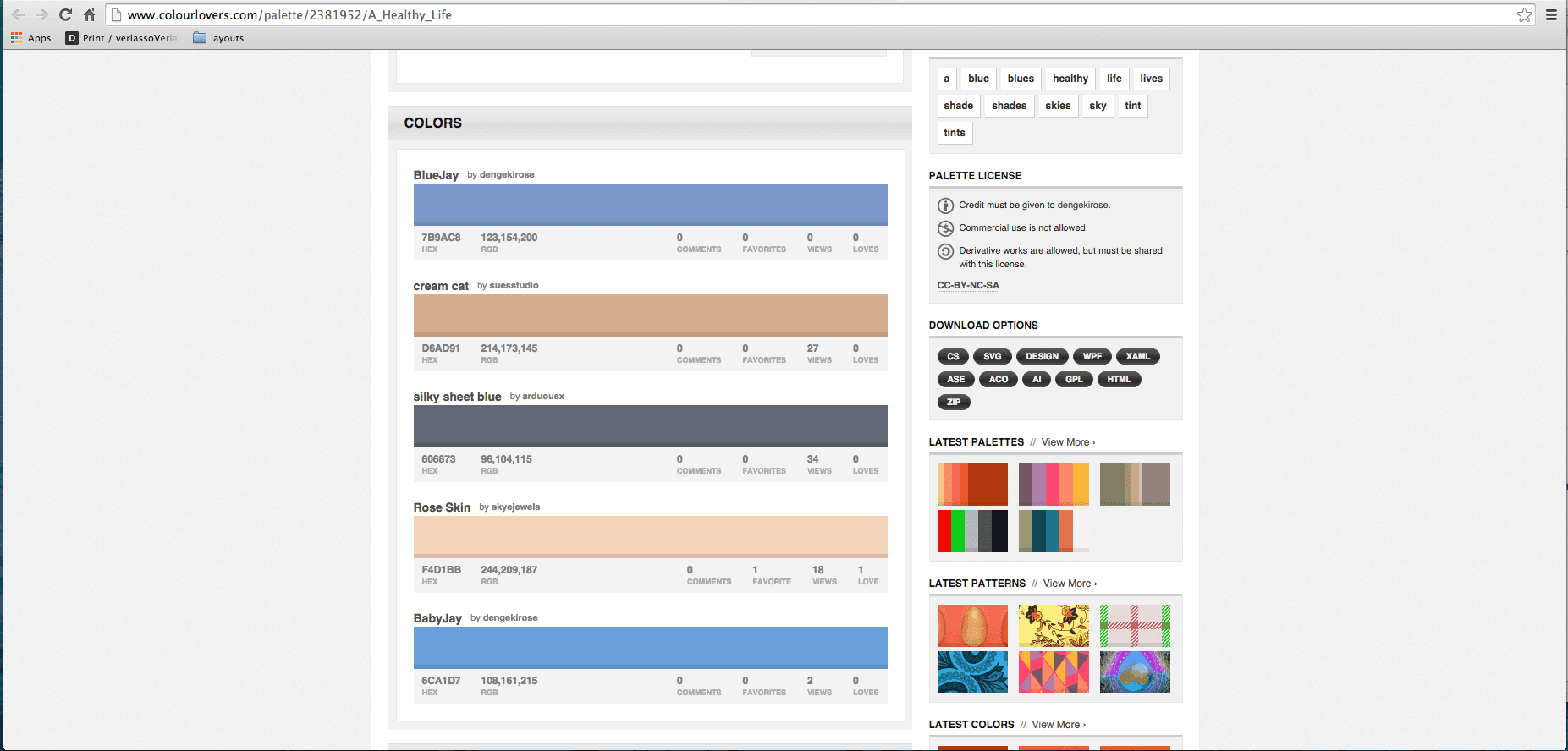
All you have to do is add the RGB codes into your color creator tool and customize your pre-made palette in PowerPoint.
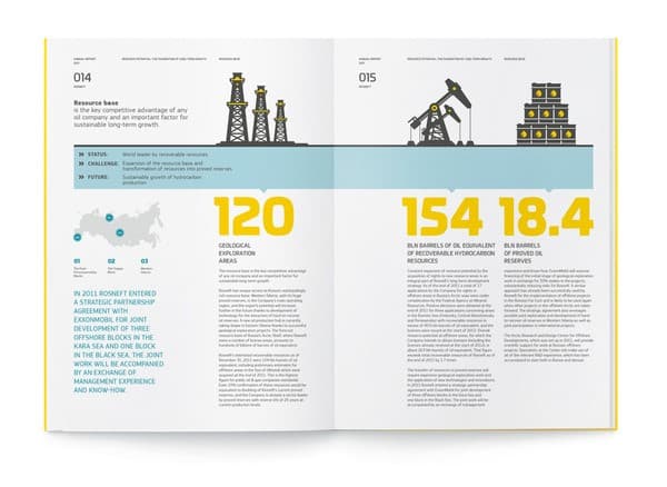
Size
When it comes to design, size matters! It is true that we are attracted to the largest element on the page. This works great when we use a larger font size for the title and a smaller one for the body text in our presentations. But there is more to it than that.
The example below is a page from the Verlasso Sustainability Brochure sourced from designspiration.net
What I like about this visual hierarchy is the free movement it is creating for my eyes. There are a number of different elements on this page that seek my attention one by one. These elements encourage me to read further. The large text in the middle shouts the key message of the study while the 87% in the left corner piques my curiosity and makes me want to find out more by reading the text underneath it. Other numbers and elements, large or small come one after another into my vision. Colors are subtle, simple, and appropriately used. In a short amount of time, I’m fully educated about the study, the key message is clear and it is highly possible that the numbers stay in my memory for a while.
Placement
Studies have shown that, when there is uncertain visual chaos on a page, the first way our brain wants to try to organize the information is in the order we were taught to read: left to right, top to bottom. Therefore, becoming more consciously aware of this tendency will help you structure your content appropriately.
Top tips for the right positioning:
- Elements that are placed in the center often tend to be perceived as the focal point
- Imagery placed on top of a page attracts the most attention whereas pictures on the bottom are less likely to be noticed at the first sight
- Alignment creates a solid structure to the page and reduces the risk of getting distracted
- On a landscape surface, placing the text on the left side and the imagery on the right side create a logical balance in the subconscious mind and it helps the reader to focus on each part separately and accordingly
Thanks for reading and until next time!
Useful links:
Header Image: Tim Arterbury, Unsplash
Comments
Comments are moderated to ensure respect towards the author and to prevent spam or self-promotion. Your comment may be edited, rejected, or approved based on these criteria. By commenting, you accept these terms and take responsibility for your contributions.
Disclaimer
The views, opinions, data, and methodologies expressed above are those of the contributor(s) and do not necessarily reflect or represent the official policies, positions, or beliefs of Greenbook.
More from Mahdis Nikou
How Not To Be Boring and Dull in the World of Market Research
When it comes to branding, market research companies aren’t excluded from the need to do this.
A Monthly Dose of Design
Introducing a new series that will explore topics related to design, branding and visual communications in the world of research.
ARTICLES
Top in Insights Industry News
Qualtrics X4 and the New Questions Facing Insights Leaders
Qualtrics X4 2026 marked a pivot from AI hype to trust and action. Explore how insights leaders navigate synthetic research and the evolving role of j...
Karen Lynch
Chief Programming Officer at Greenbook
The Signal from QRCA 2026: AI Moderation is Good Enough, Sometimes
A decision matrix to choose AI-only, Hybrid, or Human-only based on risk, stakes, and nuance.
Karen Lynch
Chief Programming Officer at Greenbook
Follow the Spark: Why San Antonio Is The Place for Qual in February
At QRCA San Antonio, gain practical skills, peer insight, and new ideas to return to your work with clarity and renewed momentum.
Kristin Marino
Chair 2026 Conference at QRCA
Walmart Data Ventures and Data Quality Co-Op Redefine Authentic Insights
How Walmart’s Customer Spark Community Raises the Bar for Data Quality
Leonard Murphy
Chief Advisor for Insights and Development at Greenbook

Sign Up for
Updates
Get content that matters, written by top insights industry experts, delivered right to your inbox.