Categories
Visualize Response Patterns and Survey Flow Using Sankey Diagrams
Sankey Diagrams are a great tool for understanding the response patterns in your survey data.
By Tim Bock
If you have spent much time analyzing survey data, then you have probably spent a lot of time validating it. This normally entails checking that the number of people answering the different questions in a survey make sense. Where the survey has skips and routing, so that different people answer different questions, it can be painful. When there is missing data, it can quickly become a nightmare. Unless you use a Sankey diagram.
Men don’t do much at home!
The Sankey diagram below shows gender (q1) by work status (q3) for fans of Desperate Housewives, a TV show that ran from 2004 to 2012. On the left side we can see that the viewers were predominantly female. Hovering your mouse over the bars will show you how many. On the right side, we also see that most viewers work full time, with less than a quarter on Home Duties. The defining characteristic of the Sankey diagram is the flows between the different variables’ values. Accordingly, the flows show that 99 of the 100 people on home duties were women! (Hover your mouse over the flows to see the numbers.)
You can create your own Sankey diagram in Displayr, by adding a data set (Home > Data Set), clicking on the Sankey diagram you can see in the middle of the page, and changing the selected Variables.
Understanding skips and missing data
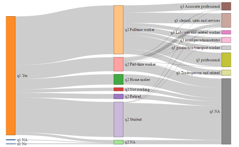
The next example shows the flow between three questions: cell phone ownership (q1), work status (q2), and occupation (q3). Looking at the right-most set of columns, we can see that around half of people have missing data, shown by a NA, for q3. The Sankey diagram allows us to quickly see where these missing values have come from.
The biggest pattern relates to q2. If people are fulltime workers (q2), they all have an occupation in q3. If they are not working, nearly all have missing data recorded.
Quite a few data integrity problems are also evident. About a third of part-time workers have occupations, suggesting inconsistency in the administration of the survey. A few students have occupations, which also suggests a problem.
Looking at the bottom, we also see that “No” in q1 (phone ownership) leads to missing data in q3. This seems odd.
We can also see that if people have missing data in either or both of question q1 or q2, they also have missing data in q3. This suggests a data cleaning problem because people with incomplete data on the first three questions in a survey should probably not be included in the main analyses from the survey).
TRY IT OUT
You can easily create these diagrams yourself in Displayr, by adding a data set (Home > Data Set), clicking on the Sankey diagram you can see in the middle of the page, and changing the selected Variables. You can create a new diagram by selecting Insert > Visualization > Sankey Diagram. These are a great tool for understanding the response patterns in your survey data.
Acknowledgements
The Sankey diagrams are created using a modified version of networkD3, created by Kenton Russell (timelyportfolio/networkD3@feature/responsive). networkD3is an HTMLwidget version of Mike Bostock’s D3 Sankey diagram code, which is inspired by Tom Counsell’s Sankey library.
Comments
Comments are moderated to ensure respect towards the author and to prevent spam or self-promotion. Your comment may be edited, rejected, or approved based on these criteria. By commenting, you accept these terms and take responsibility for your contributions.
Disclaimer
The views, opinions, data, and methodologies expressed above are those of the contributor(s) and do not necessarily reflect or represent the official policies, positions, or beliefs of Greenbook.
More from Tim Bock
Rotate Your Correspondence Analysis to Better Understand Your Brand Positioning
Tim Bock on utilizing correspondence analysis.
Data Visualization for Conjoint Analysis
Visualizations can summarize patterns that are commonly hidden in a simulator
What’s Better Than Two Pie Charts?
Bad visuals stress the need for charts to be interpretable in seconds
Using “Small Multiples” Visualizations for Big Success
Visualizing data can be made easier by utilizing small charts for comparison and analysis
ARTICLES
Top in Research Methodologies
Future Trends Emerging in Mixed-Method Marketing Research
Explore the future of mixed-method marketing research, including AI, synthetic data, continuous insights, and evolving research workflows.
Ashley Shedlock
Content Producer at Greenbook
When Easy Becomes Empty: The Frictionless Feedback Fallacy
Making surveys easier doesn’t always improve insights. Discover why thoughtful feedback design balances convenience with meaningful, reflective respon...
Tarik Covington
Founder & Chief Strategist at Covariate. Human-Centered Insights
The Always-on Agency: How to Survive the Shift to Intelligence-Native Organizations
The insight agency model is under pressure. In an always-on world, success depends on becoming a decision partner, not just a supplier of research pro...
Hannah Mann
Founding Partner at Day One Strategy
The Ambiguity of Frequent Survey Participation: Is “Hyperactivity” a Signal of Professional Fraud?
Learn how to identify engaged respondents, detect bad actors, and improve data quality for more reliable research outcomes.
Sebastian Berger
Head of Science ReDem at Rep Data

Sign Up for
Updates
Get content that matters, written by top insights industry experts, delivered right to your inbox.