Categories
Distilling Data Into Infographics
Design tips for creating visually appealing infographics
In the previous Monthly Dose of Design, we examined the future of communicating quantitative data. This month we are looking at how you can design infographics from quantitative data.
The marketing and communications landscape is fast becoming a visual world. Only 20% of people remember what they read and only 10% of people remember what they hear. But visual information makes up 90% of the information translated to our brains and is shown to improve learning by 400%. Therefore, infographics are crucial in communicating masses of complicated data, simply and effectively, to your audience and making sure your insights resonate.
To simplify the process, here are three simple steps on how to prepare, design and share your infographics.
1. Prepare your data
2. Tell a story
Once you’ve collated your data, the first thing to do is to create a narrative of how you want to communicate your insights. Remember that not everyone will be as close to the data as you are. Therefore, the best way to story-tell is to assume that your audience is not well informed.
Generally, infographics start with a leading title, then a section to briefly introduce the topic, followed by the hypothesis. Next will be the insights, which will make up the body of your infographic. You should end by summarising your key points.
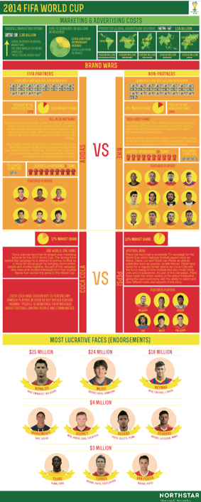
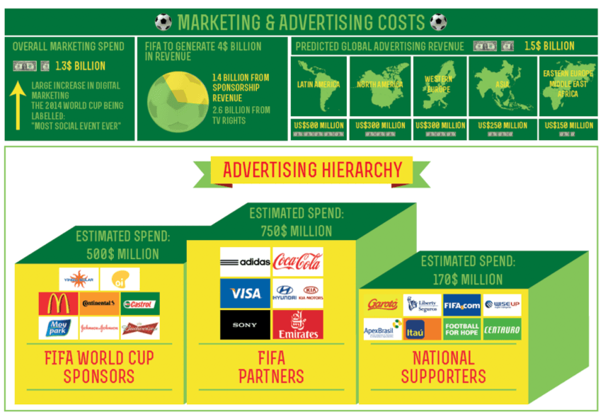
Image Caption: An infographic created in 2014 by Northstar, commenting on the branding and advertising of the 2014 Brazil World Cup.
A Bold Title
The first thing your audience will see is the title, so make sure it introduces your data well, and entices them to read on and find out more.
Hierarchy
When forming your narrative, a good technique is to group your insights based on primary and secondary importance. This will ensure the most important insights are read first and you establish a prioritisation of the data for your audience.
Layout
Whilst preparing your infographic, roughly layout where you want each insight to be placed. This will help categorise which elements are of primary and secondary importance. Additionally, it will help you develop a ‘flow’ in your infographic, something that ties all of the information and visuals together.
3. Design your data
Style
Throughout your infographic, consider what visual style you want to present your data in, for example, illustration or photographic. If illustration, what kind of illustrative style? Try to see if your insights lend themselves to any particular style.
You need to make sure that your style is consistent throughout, otherwise, you will confuse your audience. Test different sections to see if your style is successful and can be used consistently.
Be Creative, Yet Simple
Think creatively to visualise your data and see if the insights lend themselves to any creative solutions. However, don’t overcomplicate your design. You want your audience to instantly understand the message. If there is too much distraction or unnecessary imagery, you won’t achieve this.
Format
Try to consider different formats. For example, your infographic could be a poster, booklet, interactive microsite, or split into several social media gifs. Whatever your format, you need to design specifically for that format. If you are designing across several platforms, then you need to design a different layout for each platform.
5. Share your data
Social Media
We find that the best ways of sharing infographics are via websites like Information is Beautiful, Pinterest and Instagram. A great technique is to split your design into multiple social media posts and communicate bitesize visual pieces of data and hook your audience into reading more.
Don’t Forget Your Format
It is crucial to fully understand who your audience is and how they consume content. This will allow you to use an appropriate format with the correct specifications and measurements. For example, if you are creating an infographic for a sports brand aimed at millennials, the likelihood is your audience will be viewing the infographic via a smartphone. In this case, try to keep your layout and design as clear as possible. This ensures that when its shared by your audience, the insights do not get lost in a smaller format.
Next month…
We will be telling you how to effectively and creatively communicate customer segmentation.
Comments
Comments are moderated to ensure respect towards the author and to prevent spam or self-promotion. Your comment may be edited, rejected, or approved based on these criteria. By commenting, you accept these terms and take responsibility for your contributions.
Disclaimer
The views, opinions, data, and methodologies expressed above are those of the contributor(s) and do not necessarily reflect or represent the official policies, positions, or beliefs of Greenbook.
More from Emma Galvin
The Fundamentals of Layout Design for Insights
Data visualization is easy with basic design layout design principles.
Innovation Management: Barriers to Innovation (Part Five)
The five main barriers to innovation.
Innovation Management: Disruptive Innovation (Part Four)
Disruptive innovation: What it is and why it’s important to MR.
Innovation Management: Breakthrough/Radical Innovation (Part Three)
Diving into breakthrough/radical innovation and how it applies to MR.

Sign Up for
Updates
Get content that matters, written by top insights industry experts, delivered right to your inbox.