Categories
How to Create an Online Choice Simulator
Tim Bock is back to help with all your data visualization needs in this week’s article on how to create an online choice simulator.
What is a choice simulator?
A choice simulator is an online app or an Excel workbook that allows users to specify different scenarios and get predictions. Here is an example of a choice simulator.
Choice simulators have many names: decision support systems, market simulators, preference simulators, desktop simulators, conjoint simulators, and choice model simulators.
How to create a choice simulator
In this post, I show how to create an online choice simulator, with the calculations done using R, and the simulator is hosted in Displayr.
Step 1: Import the model(s) results
First of all, choice simulators are based on models. So, the first step in building a choice simulator is to obtain the model results that are to be used in the simulator. For example, here I use respondent-level parameters from a latent class model, but there are many other types of data that could have been used (e.g., parameters from a GLM, draws from the posterior distribution, beta draws from a maximum simulated likelihood model).
If practical, it is usually a good idea to have model results at the case level (e.g., respondent level), as the resulting simulator can then be easily automatically weighted and/or filtered. If you have case level data, the model results should be imported into Displayr as a Data Set. See Introduction to Displayr 2: Getting your data into Displayr for an overview of ways of getting data into Displayr.
The table below shows estimated parameters of respondents from a discrete choice experiment of the market for eggs. You can work your way through the choice simulator example used in this post here (the link will first take you to a login page in Displayr and then to a document that contains the data in the variable set called Individual-Level Parameter Means for Segments 26-Jun-17 9:01:57 AM).
Step 2: Simplify calculations using variable sets
Variable sets are a novel and very useful aspect of Displayr. Variable sets are related variables that are grouped. We can simplify the calculations of a choice simulator by using the variable sets, with one variable set for each attribute.
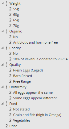
Example A
In this step, we group the variables for each attribute into separate variable sets, so that they appear as shown at right (Example A). This is done as follows:
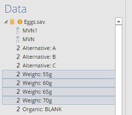
- If the variables are already grouped into a variable set, select the variable set, and select Data Manipulation > Split (Variables). In the dataset that I am using, all the variables I need for my calculation are already grouped into a single variable set called Individual-Level Parameter Means for Segments 26-Jun-17 9:01:57 AM, so I click on this and split it.
- Next, select the first attribute’s variables. In my example, this is the four variables that start with Weight:, each of which represents the respondent-level parameters for different egg weights. (The first of these contains only 0s, as dummy coding was used.)
- Then, go to Data Manipulation > Combine (Variables).
- Next set the Label for the new variable set to something appropriate. For reasons that will become clearer below, it is preferable to set it to a single, short word. For example, Weight.
- Set the Label field for each of the variables to whatever label you plan to show in the choice simulator. For example, if you want people to be able to choose an egg weight of 55g (about 2 ounces), set the Label to 55g.
- Finally, repeat this process for all the attributes. If you have any numeric attributes, then leave these as a single variable, like Price in the example here.
Step 3: Create the controls
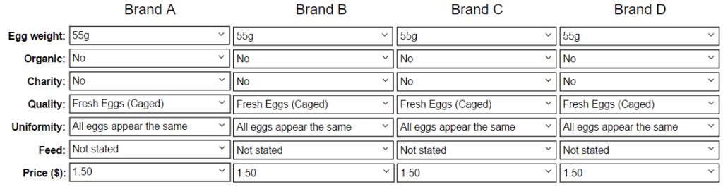
In my choice simulator, I have separate columns of controls (i.e., combo boxes) for each of the brands. The fast way to do this is to first create them for the first alternative (column), and then copy and paste them:
-
-
- Insert > Control (More).
- Type the levels, separated by semi-colons, into the Item list. These must match, exactly, to the labels that you have entered for the Labels for the first attribute in point 5 in the previous step. For example: 55g; 60g; 65g; 70g. I recommend using copy and paste because if you make some typos they will be difficult to track down. Where you have a numeric attribute, such as Price in the example, you enter the range of values that you wish the user to be able to choose from (e.g., 1.50; 2.00; 2.50; 3.00; 3.50; 4.00; 4.50; 5.00).
- Select the Properties tab in the Object Inspector and set the Name of the control to whatever you set as the Label for the corresponding variable set with the number 1 affixed at the end. For example, Weight.1 (You can use any label, but following this convention will save you time later on.)
- Click on the control and select the first level. For example, 55g.
- Repeat these steps until you have created controls for each of the attributes, each under each other, as shown above.
- Select all the controls that you have created, and then select Home > Copy and Home > Paste, and move the new set of labels to the right of the previous labels. Repeat this for as many sets of alternatives as you wish to include. In my example, there are four alternatives.
- Finally, add labels for the brands and attributes: Insert > TextBox (Text and Images).
-
See also Adding a Combo Box to a Displayr Dashboard for an intro to creating combo boxes.
Step 4: Calculate preference shares
-
-
- Insert an R Output (Insert > R Output (Analysis)), setting it to Automatic with the appropriate code, and positioning it underneath the first column of combo boxes. Press the Calculate button, and it should calculate the share for the first alternative. If you paste the code below, and everything is setup properly, you will get a value of 25%.
- Now, click on the R Output you just created, and copy-and-paste it. Position the new version immediately below the second column of combo boxes.
- Modify the very last line of code, replacing [1] with [2], which tells it to show the results of the second alternative.
- Repeat steps 2 and 3 for alternatives 3 and 4.
-
The code below can easily be modified for other models. A few key aspects of the code:
-
-
- It works with four alternatives and is readily modified to deal with different numbers of alternatives.
- The formulas for the utility of each alternative are expressed as simple mathematical expressions. Because I was careful with the naming of the variable sets and the controls, they are easy to read. If you are using Displayr, you can hover over the various elements of the formula and you will get a preview of their data.
- The code is already setup to deal with weights. Just click on the R Output that contains the formula and apply a weight (Home > Weight).
- It is set up to automatically deal with any filters. More about this below.
-
R Code to paste:
|
1
2
3
4
5
6
7
8
9
10
11
12
13
14
15
16
17
18
|
# Computing the utility for each alternativeu1 = Weight[, Weight.1] + Organic[, Organic.1] + Charity[, Charity.1] + Quality[, Quality.1] + Uniformity[, Uniformity.1] + Feed[, Feed.1] + Price*as.numeric(gsub("\\$", "", Price.1))u2 = Weight[, Weight.2] + Organic[, Organic.2] + Charity[, Charity.2] + Quality[, Quality.2] + Uniformity[, Uniformity.2] + Feed[, Feed.2] + Price*as.numeric(gsub("\\$", "", Price.2))u3 = Weight[, Weight.3] + Organic[, Organic.3] + Charity[, Charity.3] + Quality[, Quality.3] + Uniformity[, Uniformity.3] + Feed[, Feed.1] + Price*as.numeric(gsub("\\$", "", Price.3))u4 = Weight[, Weight.4] + Organic[, Organic.4] + Charity[, Charity.4] + Quality[, Quality.4] + Uniformity[, Uniformity.4] + Feed[, Feed.1] + Price*as.numeric(gsub("\\$", "", Price.4))# Computing preference sharesutilities = as.matrix(cbind(u1, u2, u3, u4))eutilities = exp(utilities)shares = prop.table(eutilities, 1)# Filtering the shares, if a filter is applied.shares = shares[QFilter, ]# Filtering the weight variable, if required.weight = if (is.null(QPopulationWeight)) rep(1, length(u1)) else QPopulationWeightweight = weight[QFilter]# Computing shares for the total sampleshares = sweep(shares, 1, weight, "*")shares = as.matrix(apply(shares, 2, sum))shares = 100 * prop.table(shares, 2)[1] |
Step 5: Make it pretty
If you wish, you can make your choice simulator prettier. The R Outputs and the controls all have formatting options. In my example, I got our designer, Nat, to create the pretty background screen, which she did in Photoshop, and then added using Insert > Image.
Step 6: Add filters
If you have stored the data as variable sets, you can quickly create filters. Note that the calculations will automatically update when the viewer selects the filters.
Step 7: Share
To share the dashboard, go to the Export tab in the ribbon (at the top of the screen), and click on the black triangle under the Web Page button. Next, check the option for Hide page navigation on exported page and then click Export… and follow the prompts.
Note, the URL for the choice simulator I am using in this example is https://app.displayr.com/Dashboard?id=21043f64-45d0-47af-9797-cd4180805849. This URL is public. You cannot guess or find this link by web-searching for security reasons. If, however, you give the URL to someone, then they can access the document. Alternatively, if you have an annual Displayr account, you can instead go into Settings for the document (the cog at the top-right of the screen) and press Disable Public URL. This will limit access to only people who are set up as users for your organization. You can set up people as users in the company’s Settings, accessible by clicking on the cog at the top-right of the screen. If you don’t see these settings, contact [email protected] to buy a license.
Create your own choice simulator
You can see the choice simulator in View Mode here (as an end-user will see it), or you can create your own choice simulator here (first log into Displayr and then edit or modify a copy of the document used to create this post).
Comments
Comments are moderated to ensure respect towards the author and to prevent spam or self-promotion. Your comment may be edited, rejected, or approved based on these criteria. By commenting, you accept these terms and take responsibility for your contributions.
Disclaimer
The views, opinions, data, and methodologies expressed above are those of the contributor(s) and do not necessarily reflect or represent the official policies, positions, or beliefs of Greenbook.
More from Tim Bock
Rotate Your Correspondence Analysis to Better Understand Your Brand Positioning
Tim Bock on utilizing correspondence analysis.
Data Visualization for Conjoint Analysis
Visualizations can summarize patterns that are commonly hidden in a simulator
What’s Better Than Two Pie Charts?
Bad visuals stress the need for charts to be interpretable in seconds
Using “Small Multiples” Visualizations for Big Success
Visualizing data can be made easier by utilizing small charts for comparison and analysis
ARTICLES
Navigating the ‘Build vs Buy’ Decision in ResTech
As AI simplifies product-building, MR teams must weigh build vs. buy carefully, balancing governance, reliability, and research expertise.
Jiten Madia
Founder & CEO at flowres.io
Right-Size Your Restech
Restech can save time and money, but underuse leads to wasted value. Learn simple steps to maximize your tech investment and boost renewal success.
Z Johnson
Consultant at MRXplorer
Capitalize on Market Research's Tech-Forward Future
Discover the latest innovations and technologies in the restech space amidst industry-wide slowdowns with our market research website.
John Bird
Executive Vice President at Infotools
The Evolution of B2C Consumer Segmentation in the Digital Age
Consumer segmentation has evolved from traditional demographic methods to more advanced techniques in the digital age, driven by vast data availabilit...

Sign Up for
Updates
Get content that matters, written by top insights industry experts, delivered right to your inbox.