Categories
Where Pictographs Beat Bar Charts: Proportional Data
Pictographs are exceptionally good for displaying proportions (e.g. rates, percentages, fractions).
Pictographs are exceptionally good for some types of data. In my earlier post, I discussed how they are great for showing counts. In this post, I show how useful they are for displaying proportions (e.g. rates, percentages, fractions).
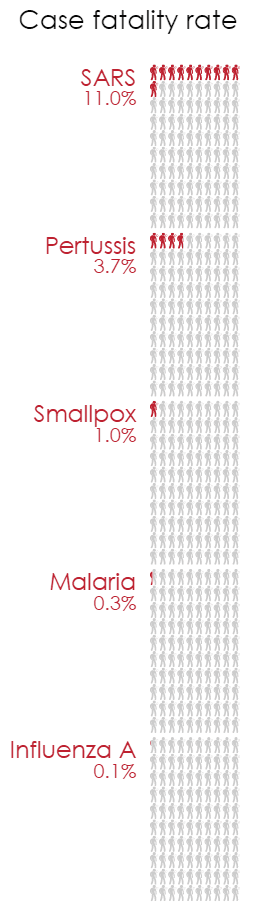
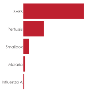
Look at the pictograph example on the right. It shows the case fatality rate using colored stick figure icons. These quantities could be just as appropriately shown using pie or bar charts (see above). However, the pictorial representation makes this statistic intuitive: out of every 100 individuals infected with SARS, you can expect 11 to die.
Pictographs have an intrinsic scale
The icons give the pictograph an intrinsic scale. Compare the pictograph (right) to the barchart (below). Both charts show that SARS is 3 times more deadly than pertussis, but the advantage of using a pictograph can be seen when we compare the other diseases. The pictograph clearly shows that the fatality rate for SARS is an order of magnitude bigger than that for smallpox. By contrast, on the bar chart, all we can see in the absence of any labels is that SARs is much bigger than smallpox.
The finer resolution provided by the icons is especially useful for the smaller
values. In the bar chart, the much larger fatality rate of SARS makes the variation between the other diseases hard to see. But in the pictograph, it is
clear that the smallpox fatality rate is at least double that of malaria.
Pictographs show quantities visually
A well designed pictograph makes quantities easy to read. In the example on the right, the small scale and the large number of icons can potentially cause problems. I avoid this by arranging the icons into 10 by 10 squares. Even without explicitly counting each icon, quantities can be evaluated by comparing the area of the square which is red.
The example on the right shows data labels in order to provide a greater level of detail. However, the main message of the chart – the enormous difference between the severity of different diseases – is effectively conveyed by the icons alone.
You can create your own pictograph or modify the example in this article here.
Originally posted here.
Comments
Comments are moderated to ensure respect towards the author and to prevent spam or self-promotion. Your comment may be edited, rejected, or approved based on these criteria. By commenting, you accept these terms and take responsibility for your contributions.
Disclaimer
The views, opinions, data, and methodologies expressed above are those of the contributor(s) and do not necessarily reflect or represent the official policies, positions, or beliefs of Greenbook.
ARTICLES
Top in Research Methodologies
Future Trends Emerging in Mixed-Method Marketing Research
Explore the future of mixed-method marketing research, including AI, synthetic data, continuous insights, and evolving research workflows.
Ashley Shedlock
Content Producer at Greenbook
When Easy Becomes Empty: The Frictionless Feedback Fallacy
Making surveys easier doesn’t always improve insights. Discover why thoughtful feedback design balances convenience with meaningful, reflective respon...
Tarik Covington
Founder & Chief Strategist at Covariate. Human-Centered Insights
The Always-on Agency: How to Survive the Shift to Intelligence-Native Organizations
The insight agency model is under pressure. In an always-on world, success depends on becoming a decision partner, not just a supplier of research pro...
Hannah Mann
Founding Partner at Day One Strategy
The Ambiguity of Frequent Survey Participation: Is “Hyperactivity” a Signal of Professional Fraud?
Learn how to identify engaged respondents, detect bad actors, and improve data quality for more reliable research outcomes.
Sebastian Berger
Head of Science ReDem at Rep Data

Sign Up for
Updates
Get content that matters, written by top insights industry experts, delivered right to your inbox.