Categories
Using Palm Trees to Visualize Performance Across Multiple Dimensions
Palm trees are great looking, easy visualizations to show multiple dimensions in your data.
By Tim Bock
Palm trees are my favorite visualization. They look great. They are easy to understand. There is no other visualization that is as effective at decomposing performance across multiple dimensions.
Palm trees perfectly align visual elements with the core underlying structure of the data. This encourages our brain to separate out additive effects from interactions – without our brains even needing to know what these terms mean!
A great looking, easy visualization to show multiple dimensions in your data
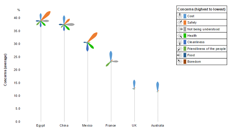
The palm trees below represent the concerns American travelers have about different destinations. The tallest palm tree is for Egypt. It has the worst performance (i.e., the most concerns). Hover your mouse over the fronds of the palm tree, and you will see the breakdown of these concerns.
Safety is clearly the top concern, although there are lots of other important concerns. Compare China. China has many issues in common with Egypt, but Not being understood is a bigger concern, and Safety is less of a concern.
If you want to play around with the the examples used in this post, or create Palm Tree Plots of your own, you can do so by clicking here.
There is no better way to visualize data with multiple dimensions
I am making a bold claim here. However, it is a claim I can back up.
There is a standard best-practice visualization for data with multiple dimensions: a line chart (I explain the logic of this below). Check out the line chart version of the same data, shown below. Yes, if you dig it is the same data and shows the same patterns. However, your brain has to work really hard to extract them.
Perfect alignment between visual elements and underlying structure of data
The visual elements of a palm tree plot mirror the structure of a two-way analysis of variance, and allow us to visualize the type of conclusions typically obtained via formal statistical testing: separation of the two main effects, and the interaction.
- Main effect 1. Three visual elements represent the average level of concern by country. 1. The height of the palm trees. 2. The average length of the fronds. 3. The order of the palm trees. In the example, it is easy to see that Egypt has marginally more concerns than China, and the UK and Australia are close to tied.
- Main effect 2. Three visual elements encode information regarding the frequency of the concerns. 1. The ordering of the concerns in the legend. 2. The ordering of the fronds (clockwise from midnight). 3. The average length of each type of frond. In our example, reproduced below, we can readily see that Safety is a huge concern, whereas Boredom is largely irrelevant. Although gross patterns can be seen here, this is the weakest aspect of the palm trees(e.g., length of frond is used to encode the prevalence of concerns, but some users will make inferences from area). For this reason, such information is better represented via a separate visualization.
- Interactions. This is where the palm trees have no equal. The statistical literature generally recommends using line charts to represent interactions. Line charts only really work for very simple data sets. The palm trees are so much better for bigger examples, such as this one. Our brains are primed to quickly spot differences in shapes. This allows us to quickly see the relationships between concerns and countries. We can readily see that, for example:
- The UK and Australia are, in terms of concerns, essentially identical: people are concerned about cost, but little else.
- People are also concerned about Cost with France, but Friendliness and Not being understood are also factors (which is a bit sad for France, as my own experience is that these have not been real issues when traveling in France for many years).
- With Mexico, concerns relate to Safety, Health, and Cleanliness.
If you want to play around with the examples used in this post, or create Palm Tree Plots of your own, you can do so by clicking here.
Acknowledgement
The OECD’s wonderful Better Life Index inspired the visualizations in this post.
This article was originally posted here.
Comments
Comments are moderated to ensure respect towards the author and to prevent spam or self-promotion. Your comment may be edited, rejected, or approved based on these criteria. By commenting, you accept these terms and take responsibility for your contributions.
Disclaimer
The views, opinions, data, and methodologies expressed above are those of the contributor(s) and do not necessarily reflect or represent the official policies, positions, or beliefs of Greenbook.
More from Tim Bock
Rotate Your Correspondence Analysis to Better Understand Your Brand Positioning
Tim Bock on utilizing correspondence analysis.
Data Visualization for Conjoint Analysis
Visualizations can summarize patterns that are commonly hidden in a simulator
What’s Better Than Two Pie Charts?
Bad visuals stress the need for charts to be interpretable in seconds
Using “Small Multiples” Visualizations for Big Success
Visualizing data can be made easier by utilizing small charts for comparison and analysis
ARTICLES
Top in Research Methodologies
Future Trends Emerging in Mixed-Method Marketing Research
Explore the future of mixed-method marketing research, including AI, synthetic data, continuous insights, and evolving research workflows.
Ashley Shedlock
Content Producer at Greenbook
When Easy Becomes Empty: The Frictionless Feedback Fallacy
Making surveys easier doesn’t always improve insights. Discover why thoughtful feedback design balances convenience with meaningful, reflective respon...
Tarik Covington
Founder & Chief Strategist at Covariate. Human-Centered Insights
The Always-on Agency: How to Survive the Shift to Intelligence-Native Organizations
The insight agency model is under pressure. In an always-on world, success depends on becoming a decision partner, not just a supplier of research pro...
Hannah Mann
Founding Partner at Day One Strategy
The Ambiguity of Frequent Survey Participation: Is “Hyperactivity” a Signal of Professional Fraud?
Learn how to identify engaged respondents, detect bad actors, and improve data quality for more reliable research outcomes.
Sebastian Berger
Head of Science ReDem at Rep Data

Sign Up for
Updates
Get content that matters, written by top insights industry experts, delivered right to your inbox.