Categories
Sankey Diagrams: A Better Way to Visualize Decision Trees
Sankey diagrams are perfect for displaying decision trees
By Tim Bock
I used to think that Sankey diagrams were just one of those cool visualizations that look amazing at first, but then don’t turn out to be useful for any real-world problems. I am happy to report I have this wrong. They are perfect for displaying decision trees (e.g., CHART, CHAID).
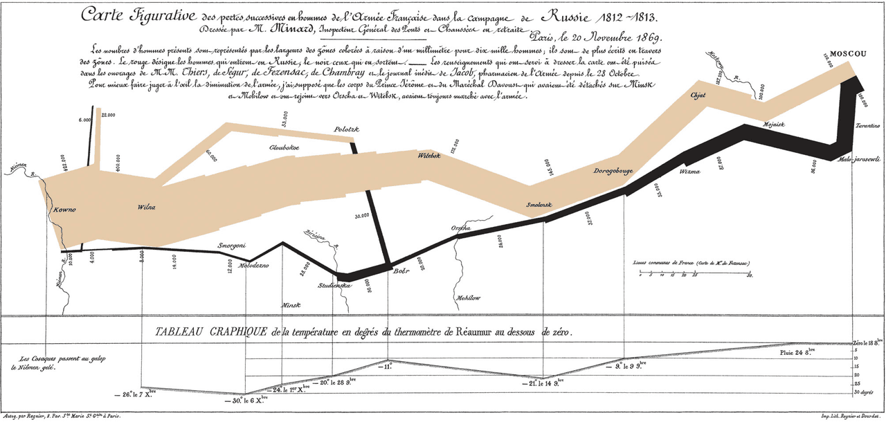
Perhaps you have not come across Sankey diagrams before? The most famous of them all, created by Charles Joseph Miniard in 1861, shows the ill-fated march of Napoleon to Moscow and back. The tree-branch-like image that goes across the visualization is proportional to the size of Napoleon’s army. Brown represents the advance of Napoleon, with the army shrinking the closer he gets to Moscow. Black shows the retreat from his Pyrrhic victory.
A more typical Sankey diagram
A more typical example is the load energy flow Sankey diagram below, which shows UK energy sources and applications.
Cool? Yes. However, I tried to apply these to a whole host of problems, and I kept getting results completely devoid of insight. Then, in an epiphany, which no doubt means that I have stolen the idea from somebody else (perhaps Kent Russell?), it occurred to me that Sankey diagrams are the perfect solution to an age-old visualization problem: how best to represent data from a classification tree.
You can can inspect the code, and play with the examples used in this post by clicking here.
The standard, difficult-to-read, tree output
The tree below is the standard output from the R tree package. This example shows the predictors of whether or not children’s spines were deformed after surgery. The tree predicts the Presence of Absence of deformation based on three predictors:
- Start: The number of the topmost vertebra operated upon.
- Age: The age in months of the patient.
- Number: The number of vertebrae operated upon.
With a bit of effort you can discern from the tree above that it has identified two segments of children for whom the probability is 50% or more:
- Start ≤ 12 and Age ≥ 128 and Numbers ≤ 4
- Start ≤ 8 and 35 ≤ Age and Number ≥ 5
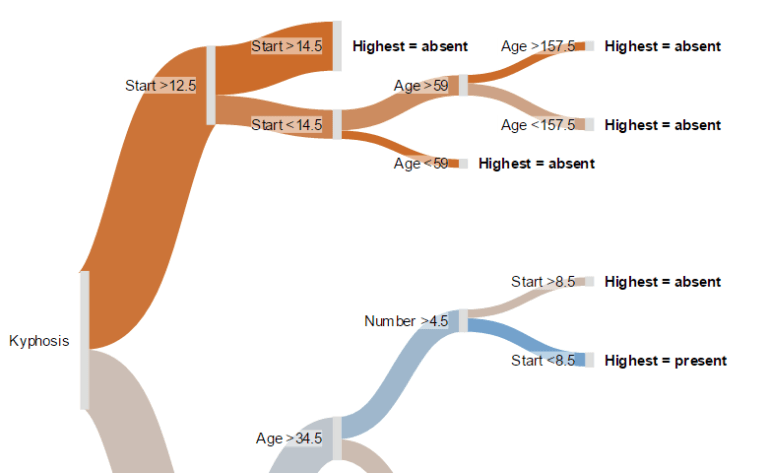
Compare the meagerness of these findings with what we obtain from the Sankey tree below.
A Sankey tree
The branches are color-coded, on a continuum of blue to red via grey. Blue means 100% chance of a deformity, grey 50% chance, and red means 0% chance. Thus, we can readily conclude the following things which could not be known from the traditional tree. For example:
- As most of the visualization is red, most children do not experience a deformity after surgery.
- The best indicator of deformity is Start. If Start is 12 or less, the chance of a deformity is comparatively low, except for the small segment for whom Start is either vertebrate 13 and 14, and age is from 60 to 157 months. If you hover your mouse pointer over this node (the second from the top, on the far-right), you will see that only 7 children fit this category, and of these 2 (29%) had a deformity.
TRY IT OUT
You can inspect the code, and play with this example using Displayr.
Acknowledgements
The data used in the Sankey tree is kyphosis from the rpart package. The Sankey tree code was a collaborative effort involving Kent Russell, Michael Wang, Justin Yap, and myself, based on a fork of networkD3, which is itself an HTMLwidget version of Mike Bostock’s D3 Sankey diagram code, which is inspired by Tom Counsell’s Sankey library. The load energy flow example is from networkD3, which is a reworking of a Sankey library example, using data from the UK’s Department of Energy & Climate Change.
Comments
Comments are moderated to ensure respect towards the author and to prevent spam or self-promotion. Your comment may be edited, rejected, or approved based on these criteria. By commenting, you accept these terms and take responsibility for your contributions.
Disclaimer
The views, opinions, data, and methodologies expressed above are those of the contributor(s) and do not necessarily reflect or represent the official policies, positions, or beliefs of Greenbook.
More from Tim Bock
Rotate Your Correspondence Analysis to Better Understand Your Brand Positioning
Tim Bock on utilizing correspondence analysis.
Data Visualization for Conjoint Analysis
Visualizations can summarize patterns that are commonly hidden in a simulator
What’s Better Than Two Pie Charts?
Bad visuals stress the need for charts to be interpretable in seconds
Using “Small Multiples” Visualizations for Big Success
Visualizing data can be made easier by utilizing small charts for comparison and analysis
ARTICLES
Top in Research Methodologies
Future Trends Emerging in Mixed-Method Marketing Research
Explore the future of mixed-method marketing research, including AI, synthetic data, continuous insights, and evolving research workflows.
Ashley Shedlock
Content Producer at Greenbook
When Easy Becomes Empty: The Frictionless Feedback Fallacy
Making surveys easier doesn’t always improve insights. Discover why thoughtful feedback design balances convenience with meaningful, reflective respon...
Tarik Covington
Founder & Chief Strategist at Covariate. Human-Centered Insights
The Always-on Agency: How to Survive the Shift to Intelligence-Native Organizations
The insight agency model is under pressure. In an always-on world, success depends on becoming a decision partner, not just a supplier of research pro...
Hannah Mann
Founding Partner at Day One Strategy
The Ambiguity of Frequent Survey Participation: Is “Hyperactivity” a Signal of Professional Fraud?
Learn how to identify engaged respondents, detect bad actors, and improve data quality for more reliable research outcomes.
Sebastian Berger
Head of Science ReDem at Rep Data

Sign Up for
Updates
Get content that matters, written by top insights industry experts, delivered right to your inbox.