Categories
Data Visualization with Tim Bock: Using Sparklines to Show Trends in Bar and Column Charts
Learn how to add sparklines to a line chart with multiple series of data to improve readability and interpretation.
Adding sparklines to a line chart that has multiple series of data can vastly improve readability and interpretation.
Adding sparklines to a line chart that has multiple series of data can vastly improve readability and interpretation.
Line charts are one of the standard charts used in tracking market research. But, as soon as they have more than a couple of series of data, they tend to be awful. This is aptly illustrated by the example below. In The Psychology of Small Multiples, I explain the orthodox way to improve such a chart. In this article, I explore my preferred way of dealing with such data, which is to combine column charts with sparklines.
The problems with line charts
Why is the chart above hopeless? It fails to achieve the three core objectives of a good visualization of time-series data (e.g., tracking data):
- There is no easy way to see the actual results of the most recent time period. Yes, we can see the relativities, but we can’t see the actual values. In many businesses, remuneration calculations and reports to the board use these values. So the chart fails for such uses.
- There is no way to determine if the change from the previous wave is meaningful or not. Yes, in theory, we can add statistical significance to the chart, but it would just turn a big mess into an impenetrable mess.
- It is really hard to spot the trends. As I discuss in The Psychology of Small Multiples, we cannot readily make out patterns in such charts.
While one solution is to use small multiples, this only really addresses the third of these issues.
Adding sparklines
Visualization guru Edward Tufte introduced the idea of using really small charts to illustrate trends and other patterns. He calls these small charts sparklines. You can see examples of sparklines here and how he uses them.
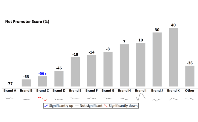
I find that sparklines are particularly useful to augment column charts. The chart below has been designed to resolve the three problems with line charts that I described above.
Each column shows the most recent wave of the tracker, with the number at the top of the chart, so that the viewer can quickly see the current state-of-play.
Arrows communicate which of the new results are significantly different from those of the previous wave. In this example, brand C has improved since the previous month. We can also augment the chart to show additional results. For example, it can show the results from the previous wave or the differences between the waves.
A sparkline is shown at the base of each column. The sparklines plot the data for whatever length of time is strategically relevant (6 months in this example). The sparklines have been color-coded with the red dashed line indicating long-term declines. Thus, we can see that brand C’s recent improvement is against a long-term trend of decline.
This visualization allows the viewer to easily answer the three important questions in tracking data: where are we today, movement since last time and long-term trend.
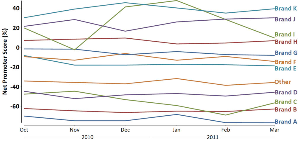
An interactive example involving sparklines
The visualization below uses the same basic idea, except in this case I have not shown statistical significance. Click here to see the interactive version using sparklines. Users can hover over the sparklines and see the historic values.
Conclusion
The basic idea in this post is a simple one. Rather than try and create one chart to serve multiple purposes, we can instead deconstruct the data into multiple separate charts: using easy-to-read column and bar charts to show key results and using sparklines to show trends.
Comments
Comments are moderated to ensure respect towards the author and to prevent spam or self-promotion. Your comment may be edited, rejected, or approved based on these criteria. By commenting, you accept these terms and take responsibility for your contributions.
Disclaimer
The views, opinions, data, and methodologies expressed above are those of the contributor(s) and do not necessarily reflect or represent the official policies, positions, or beliefs of Greenbook.
More from Tim Bock
Rotate Your Correspondence Analysis to Better Understand Your Brand Positioning
Tim Bock on utilizing correspondence analysis.
Data Visualization for Conjoint Analysis
Visualizations can summarize patterns that are commonly hidden in a simulator
What’s Better Than Two Pie Charts?
Bad visuals stress the need for charts to be interpretable in seconds
Using “Small Multiples” Visualizations for Big Success
Visualizing data can be made easier by utilizing small charts for comparison and analysis
ARTICLES
Top in Research Methodologies
When Easy Becomes Empty: The Frictionless Feedback Fallacy
Making surveys easier doesn’t always improve insights. Discover why thoughtful feedback design balances convenience with meaningful, reflective respon...
Tarik Covington
Founder & Chief Strategist at Covariate. Human-Centered Insights
The Always-on Agency: How to Survive the Shift to Intelligence-Native Organizations
The insight agency model is under pressure. In an always-on world, success depends on becoming a decision partner, not just a supplier of research pro...
Hannah Mann
Founding Partner at Day One Strategy
The Ambiguity of Frequent Survey Participation: Is “Hyperactivity” a Signal of Professional Fraud?
Learn how to identify engaged respondents, detect bad actors, and improve data quality for more reliable research outcomes.
Sebastian Berger
Head of Science ReDem at Rep Data
Ethical by Design: The Questions Every Mixed-Method Research Team Should Be Asking
Explore the ethical questions researchers should ask when combining surveys, interviews, AI analysis, synthetic data, and behavioral tracking in mixed...
Ashley Shedlock
Content Producer at Greenbook

Sign Up for
Updates
Get content that matters, written by top insights industry experts, delivered right to your inbox.