Categories
5 Ways to Visualize Relative Importance Scores from Key Driver Analysis
Tim Bock shares five alternative ways of presenting the results of key driver analysis.
By Tim Bock
Key driver analysis techniques, such as Shapley Value, Kruskal Analysis, and Relative Weights, are useful for working out the most important predictor variables for some outcome of interest (e.g., the drivers of satisfaction or NPS). But, what is the best way to report them? In this post, I illustrate 5 ways of presenting the results of key driver analysis.
To this end, I use a case study on the cola market, where a survey measured attitudes to six brands. Each brand was rated on on 34 different personality dimensions: “Next, we would like you to imagine that each of the cola brands you see below has a distinct personality. Using your imagination, take a moment and think about what kind of personality each cola would have, e.g., masculine/feminine, shy/out-going, etc.” All the visualizations in this post can be replicated here.
1. A table with statistical significance
In the rest of this post I show nice graphical outputs, but I start with a table. I find this is often the best way for me to get my bearings when checking that the driver analysis has been useful. The advantage that the table has over the prettier outputs, is that we can simultaneously see:
- The relative importance scores, scaled so that their absolute values sum to 100. The key things to look for here are that the relativities make sense. In this example, where the focus is on understanding brand positioning, eight drivers have a negative relative importance, which does not make sense. The fix in this case is to exclude these variables, as done in the next output. (Not all software for computing relative importance outputs negative scores, so if your results are all positive it is useful to check that this is not merely an assumption of the software.)
- The Raw scores which sum to the R-square statistic. These are by definition always positive, and are used to compute the relative importance scores. They do this by being scaled so that their absolute values sum to 100, with signs from a standard multiple regression. These allow us to quickly verify that many of the predictors in this example are trivial.
- The p-values, and the associated t-statistics, and standard errors.
2. Bar or column charts
The classic way of showing importance is as a bar or column chart. Often there are large numbers of variables, which makes it difficult to get a readable chart. For instance, note the overlapping labels on the example chart below.
3. Pie and donut charts
Although the purists hate them, pie and donut charts are often useful when portraying importance scores. They allow viewers to get a feeling for the cumulative impact of the drivers. In this example, we can see that only 3 of our drivers explain more than one-quarter of the variance, and seven explain more than half the variance.
4. Performance-importance charts
Performance-importance charts, also known as quad charts, show the importance scores relative to the average values on the predictor variable. The example below shows the performance for Diet Coke. This labeled scatteplot allows us to quickly see that Diet Coke does really well on one thing, being Health Conscious, but this is not very important. The things that are important – being Reliable, Fun, and Confident – are all things that Diet Coke does poorly on.
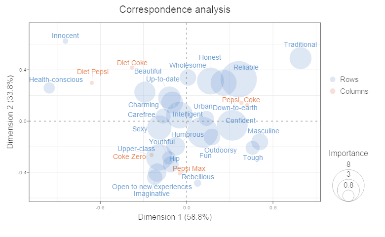
5. Correspondence analysis bubble charts
This last visualization shows a bubble chart: correspondence analysis determines the positions of the bubbles and the relative importance their sizes. We can see that Diet Coke and Diet Pepsi are skewing towards being Innocent and Health-Conscious. The more popular Coke and Pepsi are associated with being Traditional, Reliable, and Confident.
TRY IT OUT
You can replicate these visualizations for yourself in Displayr.
Comments
Comments are moderated to ensure respect towards the author and to prevent spam or self-promotion. Your comment may be edited, rejected, or approved based on these criteria. By commenting, you accept these terms and take responsibility for your contributions.
Disclaimer
The views, opinions, data, and methodologies expressed above are those of the contributor(s) and do not necessarily reflect or represent the official policies, positions, or beliefs of Greenbook.
More from Tim Bock
Rotate Your Correspondence Analysis to Better Understand Your Brand Positioning
Tim Bock on utilizing correspondence analysis.
Data Visualization for Conjoint Analysis
Visualizations can summarize patterns that are commonly hidden in a simulator
What’s Better Than Two Pie Charts?
Bad visuals stress the need for charts to be interpretable in seconds
Using “Small Multiples” Visualizations for Big Success
Visualizing data can be made easier by utilizing small charts for comparison and analysis
ARTICLES
Top in Research Methodologies
Future Trends Emerging in Mixed-Method Marketing Research
Explore the future of mixed-method marketing research, including AI, synthetic data, continuous insights, and evolving research workflows.
Ashley Shedlock
Content Producer at Greenbook
When Easy Becomes Empty: The Frictionless Feedback Fallacy
Making surveys easier doesn’t always improve insights. Discover why thoughtful feedback design balances convenience with meaningful, reflective respon...
Tarik Covington
Founder & Chief Strategist at Covariate. Human-Centered Insights
The Always-on Agency: How to Survive the Shift to Intelligence-Native Organizations
The insight agency model is under pressure. In an always-on world, success depends on becoming a decision partner, not just a supplier of research pro...
Hannah Mann
Founding Partner at Day One Strategy
The Ambiguity of Frequent Survey Participation: Is “Hyperactivity” a Signal of Professional Fraud?
Learn how to identify engaged respondents, detect bad actors, and improve data quality for more reliable research outcomes.
Sebastian Berger
Head of Science ReDem at Rep Data

Sign Up for
Updates
Get content that matters, written by top insights industry experts, delivered right to your inbox.